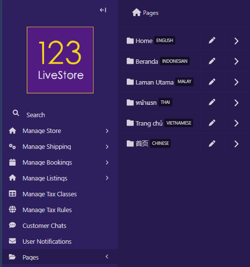
23 Pages
Design Philosophy
Pages follow a “Parent-Child” relationship. A parent page is any page that is an ancestor of other pages in the site’s tree structure. A child page is any page that is a descendant of another page in the site’s tree structure. A lot of specific site functionality is broken up into these “Parent-Child” relationships. For example, if you want to add a blog to your site, you would add a “List of Articles” page, which would have your “Article" pages as descendants.
A site’s page structure could look like the following:
Home page -> List of Articles page -> Article page
In this example, Home page is a direct ancestor/parent of List of Articles landing page. List of Articles landing page is a direct descendant/child of Home page. List of Articles landing page is also a direct ancestor/parent of Article page. Article page is a direct descendant/child of List of Articles landing page.
Page Types
The template includes several abstract page types that provide common website functionality:
- Booking Landing Page
- Directory Index Page
- Form
- List of Articles
- List of Events
- List of Locations
- List of Newsletters
- List of Products
- Listing Index Page
- Web Page
Create New Pages
To create a new page, click the Add button at the top of the page. This creates a child page of the section you are currently in. In this case, a child page of the Home page.
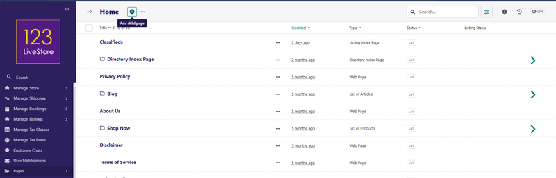
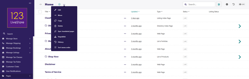
There are other actions relating to pages available in the Actions menu next to the Add button:
After clicking the Add button, you will see a list of page types you can create from your current location.
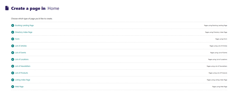
Click on the page type you want to create. For example, to create a content page, click on 'Web Page', and you should see this:
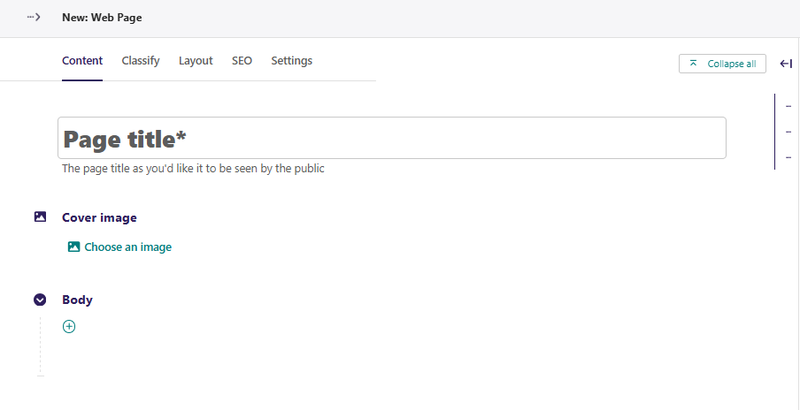
Provide an appropriate Page Title for your new web page.
To add content to the page, start by selecting the appropriate Layout Block.
Layout Blocks
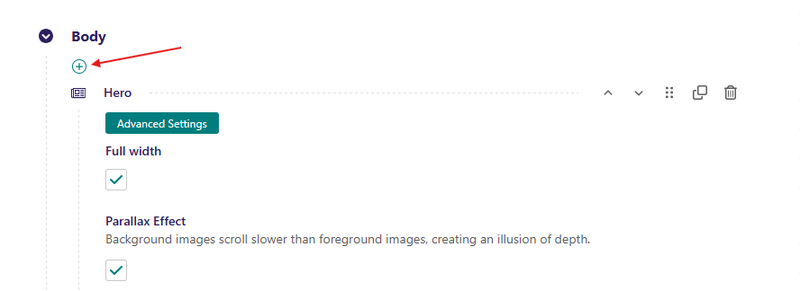
When editing any page, click the "+" Add button, and the layout block chooser appears. It allows the user to choose among available layout block types, which vary depending on the page and field configuration.
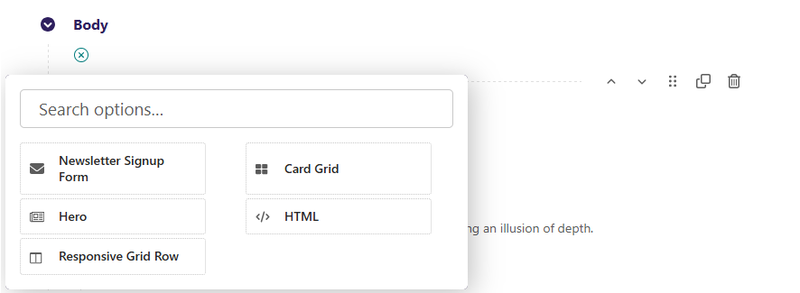
Layout Blocks available include the following:
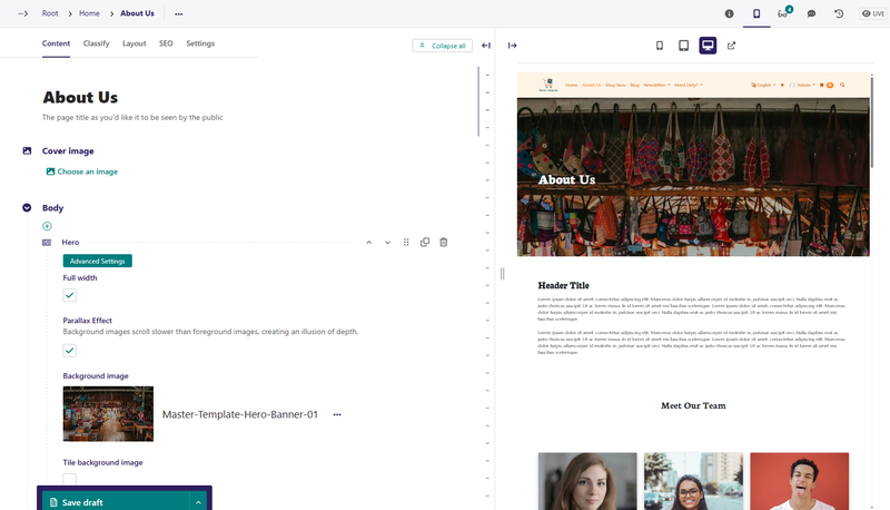
Hero Block
A banner block with an image and some text, if desired.
Field Reference
Fields and purposes:
- Full Width - If selected, sets whether the hero spans the entire width of the screen
- Parallax Effect - If selected, background images scroll slower than foreground images, creating an illusion of depth.
- Background Image - Image chooser for the background image
- Tile Background - If selected, background image will be repeated in a tile pattern
- Background Color - Sets a background color to display with hexadecimal, RGBA, or CSS color notation (e.g. #ff0011)
- Text Color - Sets the color of the text for the entire hero block
- Content - Additional layout options such as a Responsive Grid Row, Card Grid, or HTML
Responsive Grid Row Block
A block that creates a responsive grid row to hold and organize site content
Field Reference
Fields and purposes:
- Full Width - If selected, sets whether the row spans the entire width of the screen
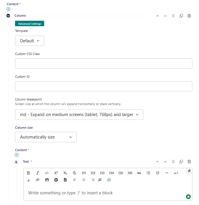
- Content - Starts with a Column (required) with content block choices
You can add as many columns as you would like; however, a responsive grid row requires at least one column with at least one piece of content.
Column Size can be set automatically based on how many columns you have and the size of the content; however, you may want to choose which size to make your columns, depending on your layout design.
Learn more about Bootstrap column sizing and Bootstrap breakpoints.
HTML Block
The HTML block allows you to add HTML to your page inside of the CMS. This is useful for small bits of code that you may want to add without needing to build a custom template or override one that you are using.
Field Reference
This block includes a space for adding your custom HTML. Only use this block when you want to add something that can’t be added with any of the other blocks, or that is not as integral to the page function as what would need to be in a template instead.
Card Grid Block
Creates a card grid layout with content and button options. Card Grid puts cards in a row by default. You can use Bootstrap classes to achieve specific layouts. See bootstrap docs for more information.
Field Reference
Fields and purposes:
- Full Width - If selected, sets whether the card grid spans the entire width of the screen
- Content - The individual cards in the grid.
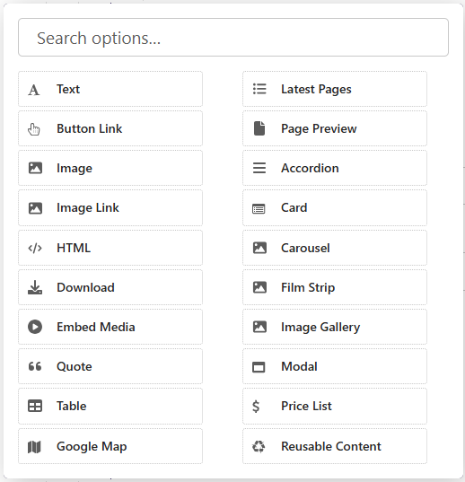
Content Blocks
Content Blocks are created inside Layout Blocks. There are 20 different types of content blocks available:
Text Block
The most used content block would be the Text Block. It allows the user to create formatted text with headers, lists, links, and media. This is one of the most versatile editors. It’s best to try out all the options to get a feel for what it can do.
Field Reference
The text block does not have specific fields. It has a space for writing content with formatting options in the format bar, such as:
- bold or italic – font style formatting
- H2, H3, H4 – titles and subtitles
- numbered list or bullet list
- horizontal line or line break
- embed, link, document, or image – media content that can be embedded in the block
Button Link Block
The button link block renders an HTML anchor styled as a button. This can be used to link to pages, documents, or external links.
Field Reference
Fields and purposes:
- Page link - Reference a page within the CMS.
- Document link If a Page is not selected, reference a Document within the CMS
- Other link - If a Page or Document is not selected, the value of this field will be used as-is. If a Page is selected, then the value of this field will be appended to the Page URL. This is useful for linking to fragments or element IDs. For example: Page
/about/with Other link#teamwould then link to/about/#team. - Button Title - The text to show on the button. You can insert simple HTML here as well, such as
Learn<b>More</b>. - Button Style - The appearance of the button. This is a choice loaded from preset settings and is inserted as a CSS class in the HTML.
- Button Size - The size of the button. This is a choice loaded from preset settings and is inserted as a CSS class in the HTML.
Image Block
Allows the user to add and display an image.
Field Reference
Fields and purposes:
- Choose an Image - Choose an image
When you choose an image, a pop-up lets you search for images you have already uploaded or upload a new one.
Image Link Block
The image link block renders an image as an HTML anchor. This can be used to link to pages, documents, or external links.
Example: This looks the same as an image; however, a user can click on it to invoke an action. The cursor changes when you hover on it to indicate it’s clickable.
Field Reference
Fields and purposes:
- Page link - Reference a page within the CMS.
- Document link - If a Page is not selected, reference a Document within the CMS
- Other link - If a Page or Document is not selected, the value of this field will be used as-is. If a Page is selected, then the value of this field will be appended to the Page URL. This is useful for linking to fragments or element IDs. For example: Page
/about/with Other link#teamwould then link to/about/#team. - Image - The image to be shown as the content of the anchor.
- Alt text - Alternate text to show to search engines and screen readers.
HTML Block
The HTML block allows you to add HTML to your page inside of the CMS. This is useful for small bits of code that you may want to add without needing to build a custom template or override one that you are using.
Field Reference
This block includes a space for adding your custom HTML. Only use this block when you want to add something that can’t be added with any of the other blocks, or that is not as integral to the page function as what would need to be in a template instead.
Download Block
The download block enables users to add documents to the CMS which website visitors can download from the site. The download block is a button and has the same options.
Field Reference
- Button Title - The text to show on the button. You can insert simple HTML here as well, such as
Learn<b>More</b>. - Button Style - The appearance of the button. This is a choice loaded from preset settings and is inserted as a CSS class in the HTML.
- Button Size - The size of the button. This is a choice loaded from preset settings and is inserted as a CSS class in the HTML.
- Document Link - Link to the document, which you will need to upload into the CMS
- Advanced Settings - Add custom CSS classes or a CSS ID
When a website visitor clicks the button, the document is available for download in a new window.
Embed Media Block
The embed media block allows users to embed media like YouTube videos or SoundCloud with just a link to the external media source.
Field Reference
Fields and purposes:
- URL - The URL for the external media, whether it’s a tweet, Facebook post, YouTube video, etc.
- Advanced Settings - Add custom CSS classes or a CSS ID to style the embed with your custom CSS
Quote Block
Allows the user to enter a quote and an author.
Field Reference
Fields and purposes:
- Quote Text - The text for the quote
- Author - The author of the quote
- Advanced Settings - Add custom CSS classes or a CSS ID to style the block with your custom CSS
Table Block
Allows the user to create a table with row and column headers.
Field Reference
Fields and purposes:
- Row Header - If selected, displays the first row in the table as a header
- Column Header - If selected, displays the first column in the table as a header
- Table Caption - A heading that identifies the overall topic of the table, and is useful for screen reader users
- Table Content - A visual table for adding Content
- Advanced Settings - Add custom CSS classes or a CSS ID to style the block with your custom CSS
Google Map Block
Allows the user to add a Google Map location and display the location on the map.
Field Reference
Fields and purposes:
- Search Query - Address or search term used to find your location on the map.
- Map Title - Map title for screen readers, ex: “Map to Simple Sweet Desserts”
- Google Place ID - Place IDs uniquely identify a place in the Google Places database and on Google Maps
- Map Zoom Level - Requires API key to use zoom. ex: 1: World, 5: Landmass/continent, 10: City, 15: Streets, 20: Buildings
- Advanced Settings - Add custom CSS classes or a CSS ID to style the block with your custom CSS
Latest Pages Block
Creates a list of the most recently published pages with a specified length.
Field Reference
Fields and purposes:
- Parent Page - Shows a preview of pages that are children of the selected page. Uses ordering specified in the page’s LAYOUT tab.
- Classified By - Filters which pages are displayed by the classifier that you selected
- Number of Pages to Show - Limits how many pages are displayed to the number that you selected
Page Preview Block
Shows a miniview (a condensed version) of a selected Page.
Field Reference
Page to Preview - Select the page that you want to display a preview
Accordion Block
Creates a collapsible section with a button to toggle. Each Accordion has multiple sections or panels.
Field Reference
Fields and purposes:
- Accordion - Choose a preexisting accordion snippet, created under snippets.
Each Accordion panel needs a name and content. After you make a second panel, arrows will appear to allow you to change the order of the panels. Additional Information available in the bootstrap docs
Card Block
Allows the user to fill out information to be displayed in a card. Crops the image to a 3:2 ratio.
Field Reference
Fields and purposes:
- Image - Select the image to display in the card
- Title - The text to show for the title of the card
- Subtitle - The text to show for a subtitle, if desired
- Body - The text to show for the body of the card
- Links > Button Link - The button link to include at the bottom of the card, set to link to a page or external link
- Advanced Settings > Template - Multiple options for Card layouts.
Carousel Block
Allows the user to create a carousel with image backgrounds and relevant blocks. Carousels automatically change slides, but also have arrow controls for the user to advance or return to the previous slide. Make a Carousel by going to Snippets > Carousels and clicking Add Carousel.
Field Reference
Fields and purposes:
- Carousel - Choose a Carousel
If you don’t have any carousels already made, you can build a carousel by clicking Choose A Carousel and clicking on “Why not create one now?” in the popup box. This will take you to Snippets > Carousels, where you can create a carousel to add to the page.
Film Strip Block
Allows the user to choose a long horizontal row of scrollable panels.
Field Reference
Fields and purposes:
- Film Strip - Choose a Film Strip snippet.
If you don’t have any film strips already made, you can build a carousel by clicking Choose a Film Strip and clicking on “Why not create one now?” in the popup box. This will take you to Snippets > Film Strips where you can create a carousel to add to the page.
Image Gallery Block
Creates and displays a collage of images from a collection. Each image in the Image gallery is a link that will open a larger version of the image.
Field Reference
Fields and purposes:
- Collection - Choose the image collection to display as a Gallery
The default collection is ROOT which will choose all of the images on the site. You can, however, create custom image collections.
How To Create A Collection
- Go to Settings > Collections.
- Click the Add a Collection button on the top right-hand corner.
- Name the collection and click Create.
- Go to Images and click on each image that you want to add to the collection.
- Choose Add to collection at the bottom of the browser window. This will redirect you to another page.
- Choose the collection.
- Select Yes, add.
Once you have created a Collection, it will become available in the Image Gallery block.
Modal Block
Creates a pop-up box with a header, footer, and the ability to display the body as a block. Click the “X” in the corner or background of the page to close it.
Field Reference
Fields and purposes:
- Button Title - The text to show on the button. You can insert simple HTML here as well, such as
Learn<b>More</b>. - Button Style - The appearance of the button. This is a choice loaded from preset settings and is inserted as a CSS class in the HTML.
- Button Size - The size of the button. This is a choice loaded from preset settings and is inserted as a CSS class in the HTML.
- Modal Heading - The heading, or title, that will display on the modal
- Content - Choose from other content blocks for the body of the modal.
- Modal Footer - Choose a Simple Text footer or a button link
Once it is published, website visitors can click the button to see the pop-up message.
Price List Block
Creates a price list listing the items and their prices.
Field Reference
Fields and purposes:
- Heading - The heading (or title) for the price list
- Items - The item builder for the price list
- Image - The image chooser for a Price List Item
- Name - The name of the Price List Item
- Description - The description of the Price List Item
- Price - The price for the Price List Item as text (add currency symbols as desired)
Reusable Content Block
Allows the use of reusable content snippets on any page
Field Reference
Fields and purposes:
- Content - Chooser for reusable content
Reusable Content is created in Snippets > Reusable Content. Once you have created a block of reusable content, you can choose it for any page on your site with the Reusable Content Block.
Reusable content could be anything that you want to reuse across the site. It has layout blocks and content blocks, which let you create anything from a hero block to a responsive grid row with columns and custom content. The benefit is that if you use a particular style on various pages throughout your website, you only need to create it once – Then you can add it via the Reusable Content Block!
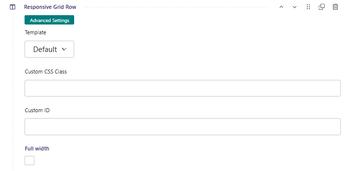
Custom CSS Classes
Every Layout Block and Content Block in your site's pages has an Advanced Settings toggle:
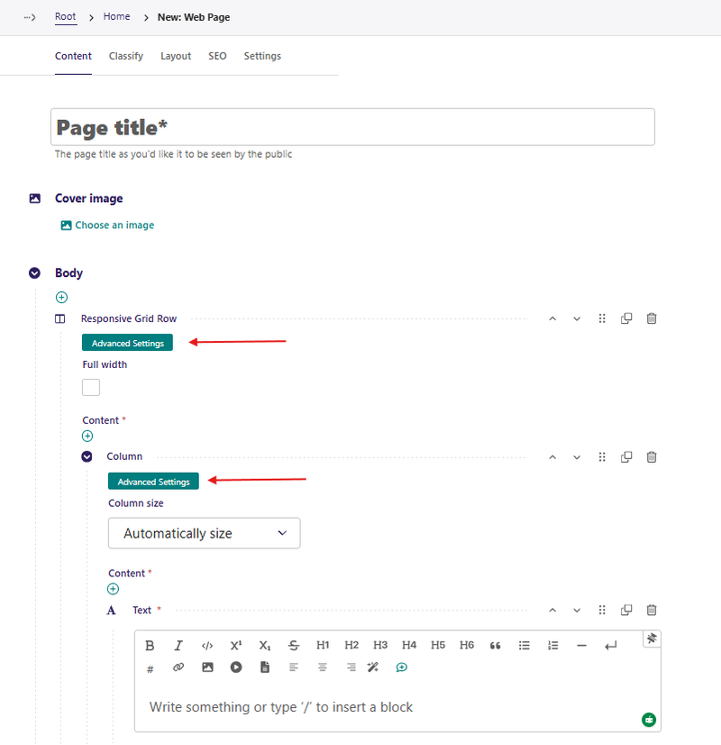
The first one above affects the Responsive Grid Row Block (Layout Block) and the second one affects the Text Block (Content Block). Click to expand it; for a Layout Block it will have these options:
And for a Content Block:
The Custom CSS Class field lets site admins add one or more CSS classes to a block without writing code.
Use it when you want to:
- add animation (`fade up`, `fade zoom`)
- adjust spacing (`mt-4`, `mb-3`, `px-4`)
- control layout (`w-100`, `text-center`, `d-flex`)
- apply visual utility styles (`shadow`, `rounded`, `border`)
You can enter multiple classes separated by spaces.
Example:
fade up mt-4 shadow rounded
Recommended Class Values (By Effect)
1. Animation Effects
Use these for scroll/show animations:
| Value | Effect |
|---|---|
| `fade up` | Fade in from below |
| `fade left` | Fade in from left |
| `fade right` | Fade in from right |
| `fade zoom` | Fade + zoom in |
| `fade slide` | Slide up from bottom |
| `fade up-fast` | Faster fade-up |
| `fade up-slow` | Slower fade-up |
| `fade zoom-bouncy` | Bouncy zoom in |
2. Spacing Utilities (Bootstrap)
| Value | Effect |
|---|---|
| `mt-0` to `mt-5` | Margin top |
| `mb-0` to `mb-5` | Margin bottom |
| `ms-0` to `ms-5` | Margin start (left in LTR) |
| `me-0` to `me-5` | Margin end (right in LTR) |
| `pt-0` to `pt-5` | Padding top |
| `pb-0` to `pb-5` | Padding bottom |
| `px-0` to `px-5` | Horizontal padding |
| `py-0` to `py-5` | Vertical padding |
3. Text and Alignment
| Value | Effect |
|---|---|
| `text-center` | Center text |
| `text-start` | Left/start align |
| `text-end` | Right/end align |
| `fw-bold` | Bold text |
| `fst-italic` | Italic text |
| `text-uppercase` | UPPERCASE text |
4. Layout and Display
| Value | Effect |
|---|---|
| `w-100` | Full width |
| `h-100` | Full height |
| `d-block` | Block display |
| `d-flex` | Flex container |
| `justify-content-center` | Center flex items horizontally |
| `align-items-center` | Center flex items vertically |
5. Visual Styling
| Value | Effect |
|---|---|
| `shadow` / `shadow-sm` / `shadow-lg` | Box shadow |
| `rounded` / `rounded-3` / `rounded-pill` | Rounded corners |
| `border` | Add border |
| `bg-light` / `bg-white` / `bg-body-secondary` | Background tone |
Button Link Help-Text Note (Important)
When using Button Link blocks, follow this rule:
> Do not put button variant classes in Custom CSS Class.
> Do not enter classes like `btn`, `btn-primary`, `btn-outline-primary`, `btn-danger`, etc.
> Use the block's Button Style and Button Size fields for button look and size.
Safe examples for button custom classes:
- `mt-3`
- `w-100`
- `fade zoom`
- `shadow-sm rounded-pill`
Unsafe examples for button custom classes:
- `btn-primary`
- `btn-outline-primary`
- `btn-lg`
Good Usage Examples
Card that fades in and has depth
fade up shadow rounded
Hero section with extra breathing room
fade up-slow py-5 text-center
Full-width CTA button with animation
w-100 fade zoom mt-3
Common Mistakes to Avoid
- Adding commas between class names (use spaces instead).
- Using invalid class names or typos (for example, `fadeup` instead of `fade up`).
- Mixing button variant classes into the button Custom CSS Class.
- Adding too many effects on one block (harder to keep design consistent).
Edit Existing Pages
You can access an existing page's edit screen in three ways.
First, by clicking … Actions and then selecting the Edit option from the dropdown. Second, by clicking the page's title if you are accessing the page from its parent's Explorer page or in search results. Last, if you are accessing the page from the Explorer page of its parent, you can hover over the page and then click Edit.
On the edit screen, you will see the title of the page you are editing at the top. If the page is already published, a link to the live version can be found in the top-right corner. To change the title, click on the title field and enter your new title.
While on the edit screen, you can perform several actions, such as copying, moving, or deleting a page. To perform any of these actions, click … Actions at the top of the edit screen and select the applicable option from the dropdown.
The template's block-based editing is called StreamField. It’s a key feature of the CMS that gives editors creative control over content.
Within a block-based StreamField, editors can:
- Insert blocks – as a list where all blocks are of the same type, or as a stream with multiple supported block types.
- Reorder blocks – with up and down controls or drag and drop.
- Duplicate blocks - to speed up content entry.
- Remove blocks.
Within blocks, the same fields are used as in other aspects of the page. Or often, blocks can be nested within other blocks.
The same block-based interface is also available for more structured data, often combined with snippets, with minor differences in capabilities (for example, the absence of the "duplicate" option).
Create and Edit Comments
To toggle on commenting mode, click Comments at the top of the edit screen page. Once commenting mode is on, you can create a new comment or reply to a comment by hovering over any commentable field to reveal the add comment icon.
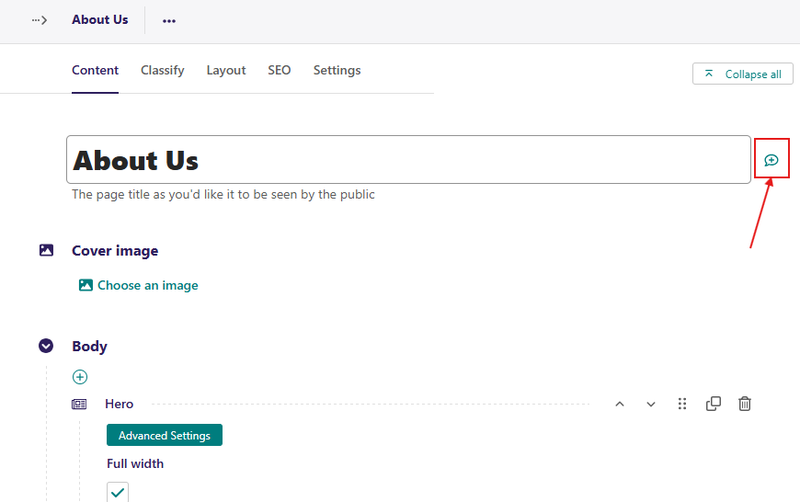
If there is no pre-existing comment in the field, click the add comment icon to create a new comment. However, if there is an existing comment, clicking either the field button or the comment brings the comment thread into focus. This allows you to add new replies.
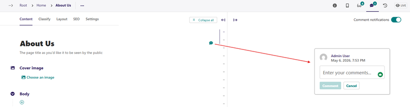
To comment on the text within the rich text field, highlight the text and then click the add comment icon to add an inline comment.
Alternatively, you can perform all of these actions using the comment shortcut, Ctrl + Alt + M on Windows and ⌘ + Alt + M on macOS.
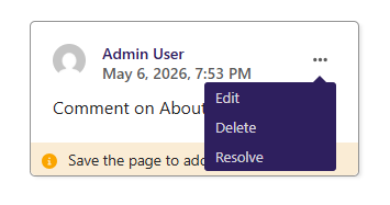
To edit, delete, or resolve a comment, click the three vertical dots in the top right of an existing comment and select the applicable option. Saving the page after leaving a comment or replying to a comment saves the comment or reply.
Fields inside InlinePanels and ListBlocks cannot be commented.
Concurrent Editing Notifications
When multiple users concurrently work on the same content, the framework displays notifications to inform them of potential editing conflicts. Those notifications initially appear as user avatars in the page header, each with a status tooltip.
When a user saves their work, other users are informed and presented with options: they can refresh the page to view the latest changes or proceed with their own changes, overwriting the other user's work.
Users are displayed as "active" in concurrent editing notifications until they switch to another application, close the browser tab, or after a set timeout.
Manage Page Privacy
Users with publish permission on a page can set it to be private by clicking the ‘Change privacy’ control in the status panel. This sets a restriction on who is allowed to view the page and its child pages. Several options are available:
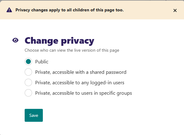
- Public: The page is accessible to anyone who can access the website.
- Private, accessible with a shared password: The user must enter the given shared password to view the page. This is appropriate for situations where you want to share a page with a trusted group of people, but giving them individual user accounts would be overkill. The same password is shared between all users, and this works independently of any user accounts that exist on the site.
- Private, accessible to any logged-in users: The user must log in to view the page. All user accounts are granted access, regardless of permission level.
- Private, accessible to users in specific groups: The user must be logged in and a member of one or more of the specified groups in order to view the page.
Manage Page History
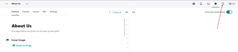
The template allows you to retrieve the version of the content you previously saved as a draft or published. You can do this by hovering over a page on the Explorer page and clicking More from the resulting dropdown options. Alternatively, you can access the page history screen by clicking the History icon in the top-right corner when editing a page.
On the page's history screen, you can see all the actions previously done on that particular page and the users who carried out the actions. Also, you can see the date or time that the action occurred.
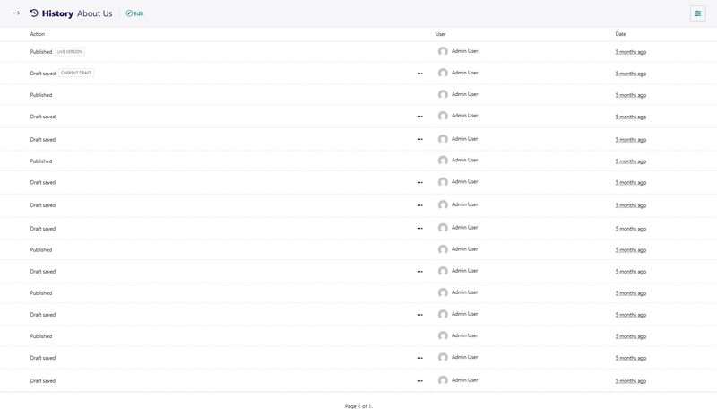
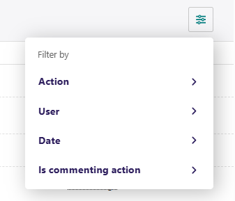
You can also search for specific versions of your content on the page history screen by applying a filter.
If you want to compare different draft versions, hover over the draft and click Compare with previous version or Compare with current version.
To replace the current version of the draft with a previous version, hover over the preferred version of your draft on the page history screen and click Review this version. Then click Replace current version located at the bottom of the screen. This action appears as a Revert action on the page history screen, and you can always go back to review it.
Workflow
If the page is currently in a workflow, you will see an additional indicator underneath the title showing the current workflow task. Clicking this shows more information about the page's progress through the workflow and any comments left by reviewers.
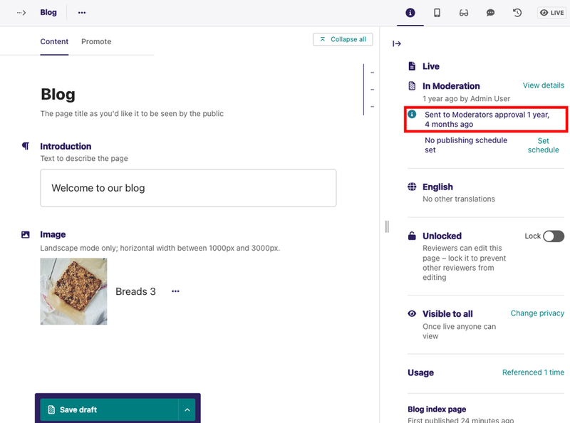
If you have permission to perform moderation actions, for example, approval or requesting changes on the current task. In that case, you can see additional options in the action bar at the bottom of the page.
Copy Pages
Sometimes, you don't need to create a new page from scratch. For example, you may have several pages that are similar in terms of structure but differ in content. In that case, you can copy an existing page and only change the required parts.
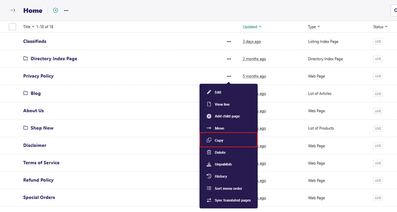
To copy an existing page, hover over a page in an Explorer page, then click More and select Copy. Selecting Copy from the dropdown takes you to a form where you can enter the title and slug of the copy and also choose its parent page. You then get the option to publish the copy right away and an option to mark the copy as an alias of the original page. Once you have completed the form, click Copy this page.
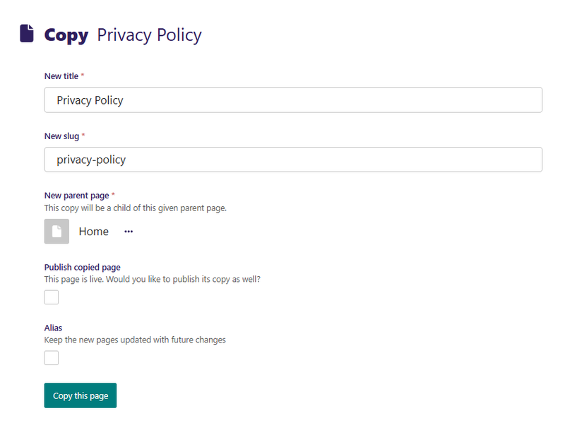
Alias Pages
When copying a page, you have the option to mark it as an alias. The content of an aliased page always stays in sync with the original.
This is useful when you want a page to be available in multiple places. One way to do this is to create a copy of the page and change the parent page to an appropriate page. However, you now need to remember to update this copy each time you modify the original page. If you mark a copy as an alias, the template automatically makes changes to the copy each time you modify and publish the original page.
Creating an alias for an existing page is similar to creating a copy. Hover over a page in the Explorer page, click More, and then select Copy. Selecting Copy takes you to the copy page form. On the copy page form, choose another page as the parent page by clicking Choose another page.
Then, click the Alias checkbox and click Copy this page to complete the aliasing.
If you try to edit the aliased page, you get a notification that it's an alias of another page. To edit an aliased page, you have two options:
- Edit the original page. This option changes both the original page and the aliased page.
- Convert the alias page to an ordinary page, which is a copy of the original. If you choose this option, you must make manual changes to the alias page in order for it to be in sync with the original page.