26 Snippets
The use of Snippets
Snippets allow you to create elements on a website once and reuse them in multiple places. You only have to change something in a snippet once, and the changes appear in all occurrences.
The use of snippets varies between websites. Our templates use snippets for the following purposes:
- For blog post authors. As a result, you can add them to multiple pages and manage them from one place.
- For adverts. This way, you can apply them site-wide or on individual pages.
- To manage links in a global area of the site. For example, in the footer.
- For calls to action, such as newsletter sign-up blocks, that may be consistent across many different pages.
The Snippets menu
You can access the snippets by clicking Snippets in the Admin Sidebar. Clicking Snippets takes you to the Snippets interface. To add, edit, or delete a snippet, click the snippet type that interests you. Clicking the snippet type takes you to the edit screen, from which you can add, edit, or delete a snippet. Hovering over an individual snippet displays the options to edit or delete that snippet. To add a new snippet to the snippet type, click Add (snippet type).
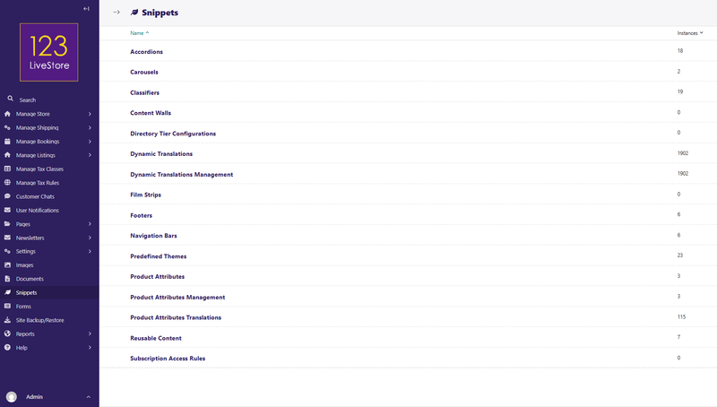
Editing a snippet changes it on all of the pages on which it appears. In the top-right corner of the Snippet edit screen, you can see a label saying how many times you have used the snippet. Clicking this label displays a listing of all of these pages.
Let's take a look at all the built-in snippet models which provide common website functionality:
01. Accordions
02. Carousels
03. Classifiers
04. Content Walls
05. Directory Tier Configurations
06. Dynamic Translations
07. Dynamic Translations Management
08. Film Strips
09. Footers
10. Navigation Bars
11. Predefined Themes
12. Product Attributes
13. Product Attributes Management
14. Product Attributes Translations
15. Reusable Content
16. Subscription Access Rules
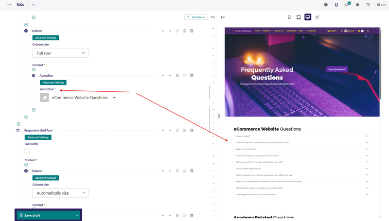
01. Accordions
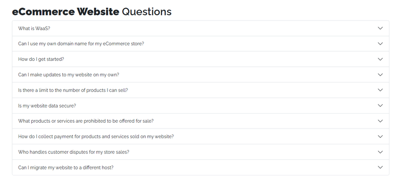
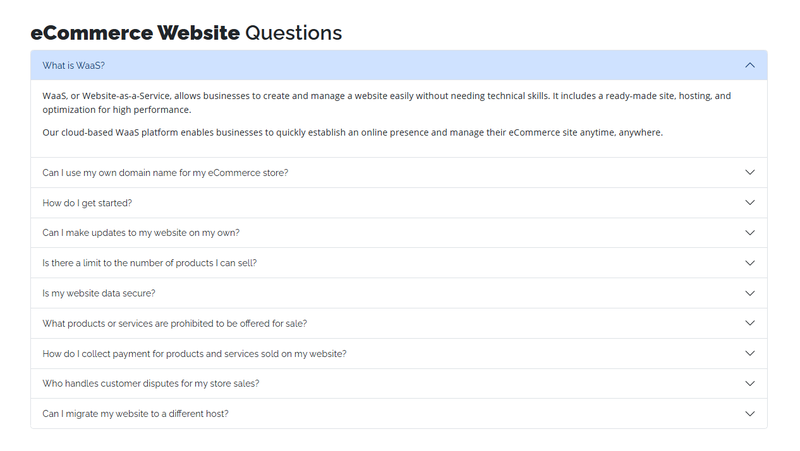
A representation of an accordion or other collapsible content. Creates a collapsible section with a button to toggle. Each Accordion has multiple sections or panels.
For example:
Add Accordion
Fields
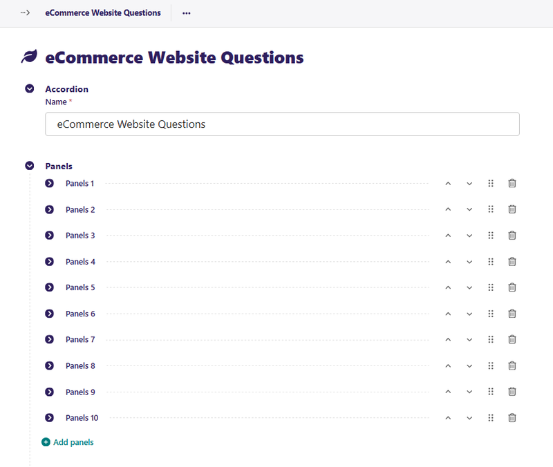
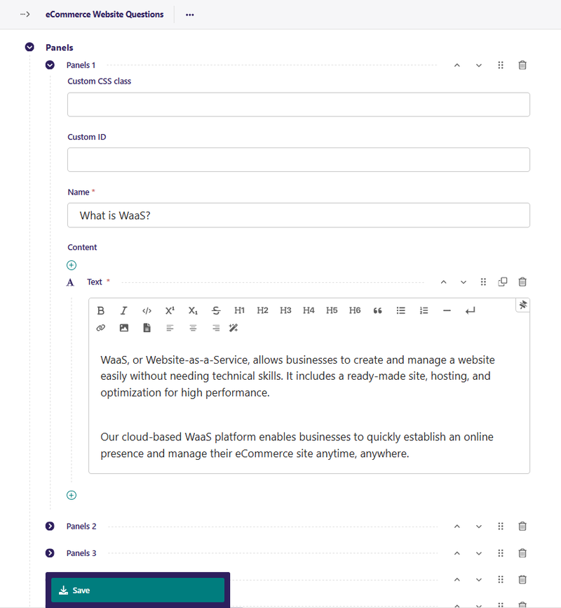
Accordion
Name: A unique name for your accordion. It can be anything; it is just used as a personal reference to easily tell them apart.
Panel
To add a panel to your accordion, click the “Add Panels” button.
Custom CSS class: If you need to add a specific CSS class for this panel, add it here.
Custom ID: If you need to add a specific ID for this panel, add it here.
Name: A name for this panel will be displayed at the top of the panel
Content: A streamfield that contains the content blocks for the panel.
Usage
You define your Accordions in the Snippets > Accordions section of the admin. Once defined, any page with a body streamfield can show that Accordion by selecting it with an Accordion block.
Tip: Create one accordion per topic (e.g., one for Shipping FAQs, one for Returns FAQs) so they can be reused on multiple pages.
Back to Top
02. Carousels
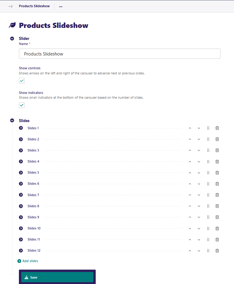
A representation of a carousel, slider or similar construct. Allows the user to create a carousel with image backgrounds and relevant blocks. Carousels automatically change slides, but also have arrow controls for the user to advance or return to the previous slide. Create a Carousel by going to Snippets > Carousels and clicking Add Carousel.
Add Carousel
Fields
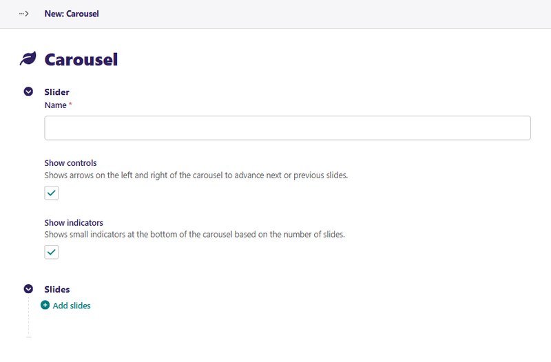
Slider
Name: A unique name for your carousel. It can be anything; it is just used as a personal reference to easily tell them apart.
Show Controls: A toggle to determine if the carousel has arrows to control which slide shows.
Show Indicators: A toggle to determine if the carousel will show dots at the bottom to indicate how many slides there are.
Slides
To add a slide to your carousel, click the Add Slides button.
Image: The background image you want to use for your slide. This is optional. It is recommended to at least set this field or the Background color field.
Background color: The background color you want to use for your slide. This is optional. It is recommended to at least set this field or the Image field.
Custom CSS class: If you need to add a specific CSS class for this slide, add it here.
Custom ID: If you need to add a specific ID for this slide, add it here.
Content: A streamfield that contains the content blocks for the slide.
In edit mode:
And each slide looks something like this:
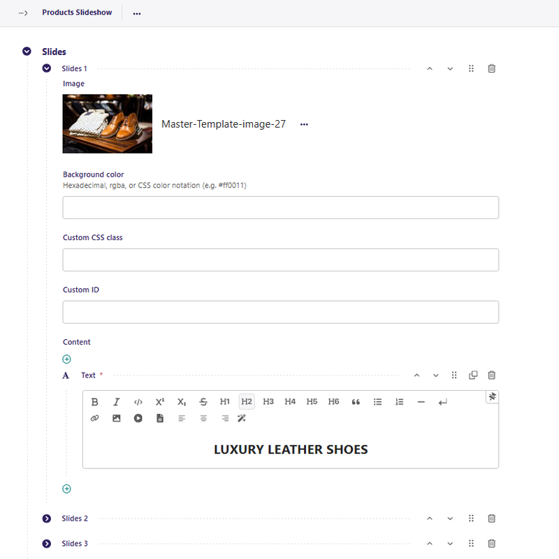
Don't forget to Save your changes!
Usage
You define your Carousels in the Snippets > Carousels section of the admin. Once defined, any page with a body streamfield can show that Carousel by selecting it with a Carousel block.
Tip: Keep slide content brief. Use high-contrast text colours or an overlay background colour so text is readable against photos.
Back to Top
03. Classifiers
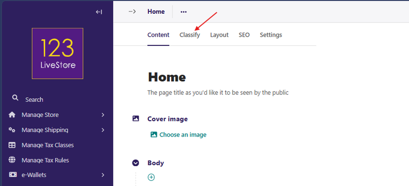
A Classifier is a taxonomy/category group used to organize and filter pages (e.g., blog posts, listings, articles). Think of it like a label group: a Classifier is the group (e.g., "Industry") and its Terms are the labels (e.g., "Retail", "Healthcare"). Classifiers provide a way to create custom categories or groups to organize and filter pages. All pages come with a Classify tab.
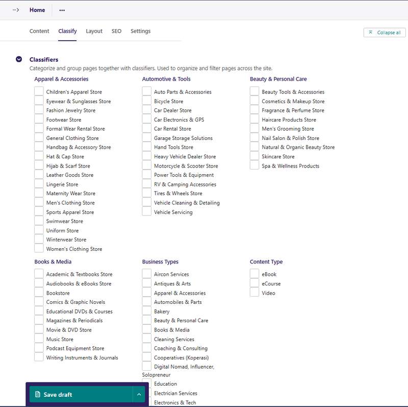
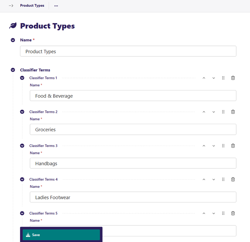
Classifiers are essentially categories that you give to an item. For example, Product Type: Food & Beverage, Groceries, Handbags, Ladies Footwear, Men's Clothing, Men's Footwear, etc.
'Product Type' above is the Classifier (or category), and the rest are 'Classifier Terms' (or sub-categories).
Usage
First, create a new Classifier under Snippets > Classifiers called 'Product Type' and add several Terms (Food & Beverage, Groceries, Handbags, Ladies Footwear, Men's Clothing, Men's Footwear, etc.) underneath the Classifier. Create and reorder these Terms as needed. Save the Classifier when finished.
Second, classify various Product pages by 'Product Type' terms:
- Edit a Product page.
- Open the Classify tab, and select the appropriate terms.
- Publish the page when finished.
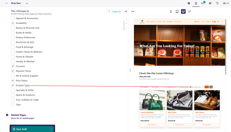
To enable filtering Product pages by 'Product Type':
- Edit your List of Products page, say 'Shop Now' (it should be the parent page of your Product Pages).
- Open the Layout tab, enable Show child pages, and then select 'Product Type' under Filter child pages by.
- Select additional Classifiers from the list of Classifiers you had previously created to provide additional filters.
- Publish or preview the page, and you’ll now see filtering options for every Classifier you selected.
Classifiers work on every page on the site. Classifiers can be used to create article types, product types, portfolios, categories, and any other organisational structures your content may need.
Tip: Classifiers are global to the site. If you need multilingual labels for classifier terms, use the Dynamic Translations snippet to add translated names.
Back to Top
04. Content Walls
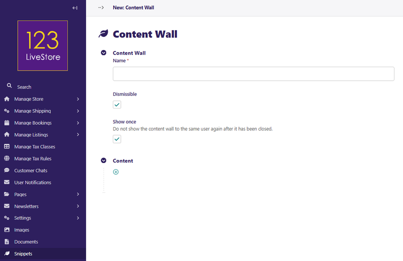
A representation of a content wall, pop-up, or similar construct. A content wall is an overlay or gate that blocks page content and prompts visitors to take an action (e.g., subscribe, log in, or accept a notice) before continuing.
Add Content Wall
Click Add Content Wall to create a new content wall:
Fields
Name: A unique name for your content wall. It can be anything, it is just used as a personal reference to easily tell them apart.
Dismissible: A toggle to determine if the content wall modal has a close button.
Show Once: A toggle to determine if the content wall will show every time the user loads the page or just the first time.
Content: A streamfield that contains the layout blocks for the content wall.
Usage
You define your content walls in the Snippets > Content Walls section of the admin. Once defined, you can go to the Settings tab of any page and add any number of your content walls to the page.
When a page is loaded, each content wall will pop up as a Bootstrap modal.
Back to Top
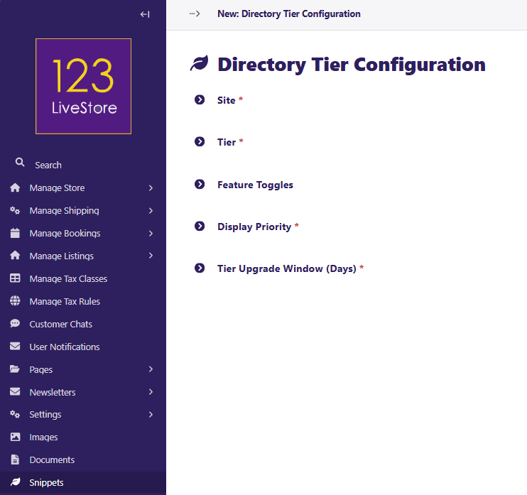
05. Directory Tier Configurations
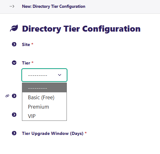
The directory feature supports a three-tier system that controls which features
are available to directory listing owners at each subscription tier (Basic, Premium, VIP). This is the central switch panel for the Directory module's tiered access system.
| Tier | Cost | Description |
|---|---|---|
| Basic | Free | Essential listing with title, location, contact info, and summary. |
| Premium | Paid (configurable) | Adds logo, gallery images, social media links, rich description, and more. |
| VIP | Paid (configurable) | All Premium features plus WhatsApp button, external links, booking link, and featured upgrade eligibility. |
Each tier's feature toggles are controlled by the Directory Tier Configuration
snippet model.
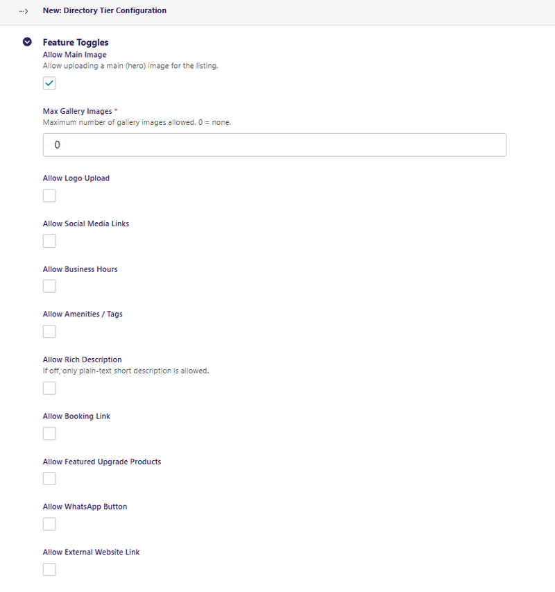
Feature Toggles
| Toggle | Purpose |
|---|---|
| Allow Main Image | Permit uploading a hero/main image for the listing |
| Max Gallery Images | Number of additional gallery photos allowed (`0` = none) |
| Allow Logo Upload | Permit a business logo on the listing |
| Allow Social Media Links | Show social media link fields |
| Allow Business Hours | Show business hours fields |
| Allow Amenities / Tags | Show amenities/feature tags |
| Allow Rich Description | Full rich-text description (if off, plain text only) |
| Allow Booking Link | Allow a link to a booking page |
| Allow Featured Upgrade Products | Allow the listing to purchase featured placement upgrades |
| Allow WhatsApp Button | Show a WhatsApp contact button |
| Allow External Website Link | Allow linking to an external website |
Other Fields
| Field | Purpose |
|---|---|
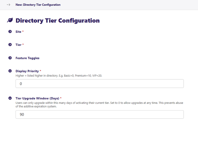
| Display Priority | Higher number = listed higher in directory results. Suggested: Basic = `0`, Premium = `10`, VIP = `20` |
| Tier Upgrade Window (Days) | How many days after activating a tier a user can upgrade to a higher tier. Set to `0` to always allow upgrades |
Usage
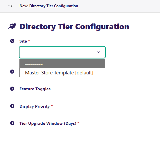
- Go to Snippets → Directory Tier Configurations and click Add directory tier configuration.
- Select the Site this applies to (default site)
- Choose the Tier (`Basic`, `Premium`, or `VIP`).
- Enable or disable feature toggles to define what that tier includes.
- Set the Display Priority and Tier Upgrade Window.
- Save. Repeat for each tier level (you need one record per tier, per site).
Important: You must create one configuration entry for each of the three tiers (`Basic`, `Premium`, `VIP`) for the directory to function correctly. Each site + tier combination is unique — you cannot have two `Premium` configs for the same site.
If you want the full guide on how to set up your website as a Directory, please go to Directory Setup.
Back to Top
06. Dynamic Translations
Dynamic Translations is a lookup table for translating site UI strings — classifier names, classifier term labels, tags, and shipping method names — into other languages. These are used for multi-language storefronts where the platform's built-in page translation doesn't cover all UI strings.
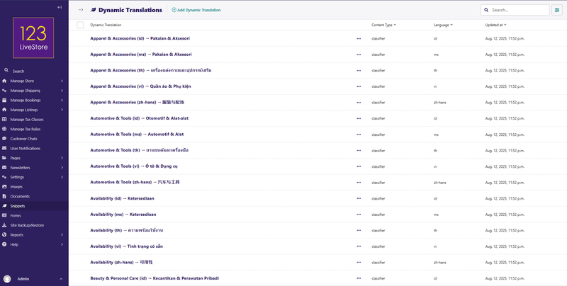
Fields
| Field | Purpose |
|---|---|
| Content Type | What kind of text is being translated (Classifier Name, Classifier Term, Tag, Shipping Method, Shipping Method Description) |
| Original Text (English) | The source English string exactly as it appears in the database |
| Language | Target language (e.g., `ms`, `zh-hans`, `th`, `vi`, `id`) |
| Translation | The translated text |
Usage
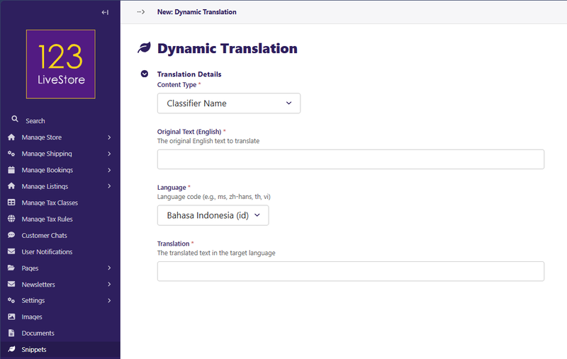
- Go to Snippets → Dynamic Translations and click Add dynamic translation.
- Choose the Content Type (e.g., "Classifier Term").
- Enter the Original Text exactly as it appears — e.g., `Free Shipping`.
- Select the Language from the dropdown.
- Enter the Translation in that language.
- Save.
Filter/search: Use the Content Type and Language dropdowns at the top of the list to narrow down entries. The search box matches original text, translated text, and language code.
Tip: The original text must match exactly (case-sensitive, including spaces). If the translation is not found, the site falls back to the English original.
Back to Top
07. Dynamic Translations Management
Dynamic Translations Management is a shortcut link in the Snippets menu that opens the dedicated Classifiers & Terms Management interface — a more powerful UI for bulk management of classifier names, terms, and their translations.
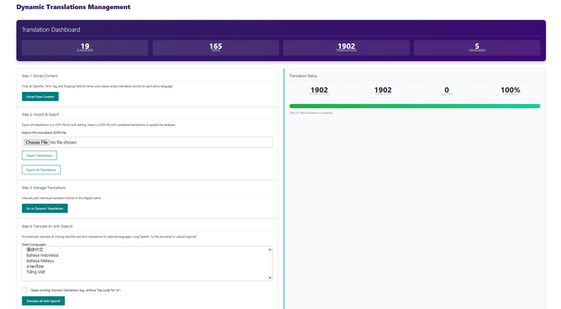
Usage
Anytime you create new Classifiers and Classifier Terms on a multi-locale site, you need to first 'Extract New Content' to be translated. If you wish to translate the new strings manually, then follow Step 3: Manage Translations. To use OpenAI translation, perform Step 4: Translate All with OpenAI. Select the languages you wish to translate. Use the Shift key together with clicking your mouse pointer on the language you wish to add to be translated, and click the 'Translate All with OpenAI'. Upon completion, the 'Pending' count should display '0'.
Back to Top
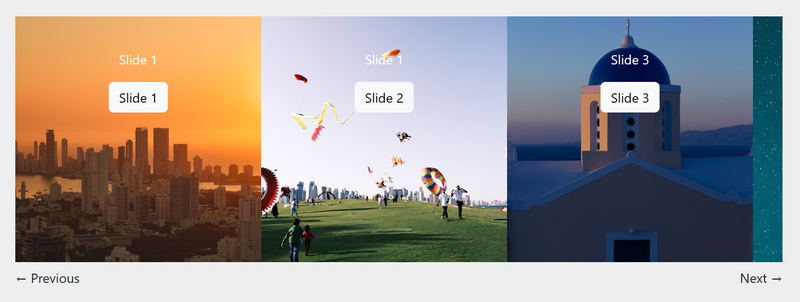
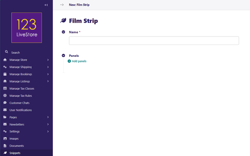
08. Film Strips
A film strip is a long horizontal row of scrollable panels, similar to a reel of film.
Usage
You define your film strips and their panels in the Snippets > Film Strips section of the admin. Once defined, any page with a body streamfield can show that film strip by selecting it with a Film Strip block.
Fields
Slider
Name: A unique name for your film strip. It can be anything; it is just used as a personal reference to easily tell them apart within the system.
Panels
To add a panel to your film strip, click the Add panels link.
Background image: An optional image that will fill the entire panel. May be cropped or scaled to fit.
Background color: An optional color that will fill the entire panel.
Text color: An optional color used for text in the panel.
Custom CSS class: If you need to add a specific CSS class for this panel, add it here.
Custom ID: If you need to add a specific ID for this panel, add it here.
Content: A streamfield that contains the content blocks for the panel.
Tip: Film Strip panels are displayed side by side. For a full-width "step" layout, add fewer panels with larger background images.
Back to Top
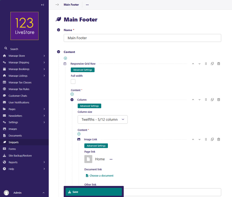
09. Footers
A Footer is a representation of a footer that sits at the bottom of your pages.
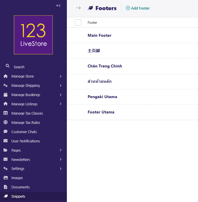
Usage
You define your Footers in the Snippets > Footer section of the admin. Once defined, your footers will render on your page, stacked on top of each other.
The reusable footer is displayed at the bottom of every page that references it. Footers are assigned to pages and can contain columns, links, social icons, legal text, and more — built using the same rich layout blocks as pages.
Fields
Name: A unique name for your footer. It can be anything, it is just used as a personal reference to easily tell them apart.
Content: A streamfield that contains the layout blocks for the content wall.
Custom CSS class: If you need to add a specific css class for this footer, add it here.
Custom ID: If you need to add a specific ID for this footer, add it here.
Back to Top
10. Navigation Bars
A Navigation Bar is a representation of a navigation bar that sits at the top of your pages.
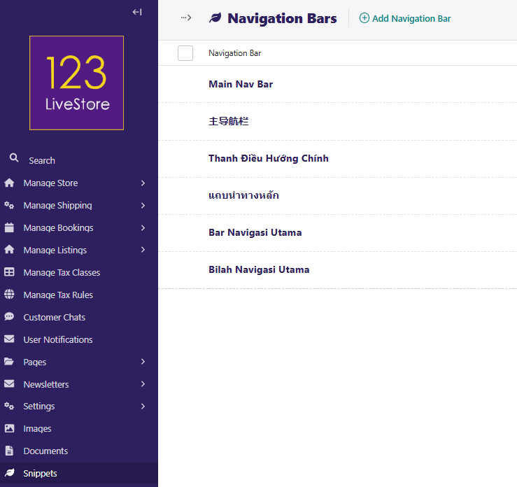
Usage
Your navbar will have links to your other pages or external content that you want to share. To build your Navbar, go to Snippets > Navigation Bars.
There is a button in the top right corner named Add Navigation Bar. Click on this button to start! (Alternatively, you can also click on the link that says “Why not add one?”)
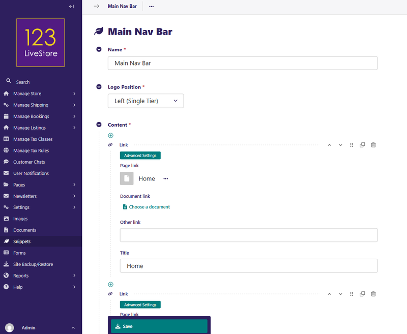
Giving the navbar a name is required. Also note, as you use different editing interfaces in admin, required fields are marked with a red asterisk (*). Since, this will be a site wide navigation bar we have named it Main Nav Bar.
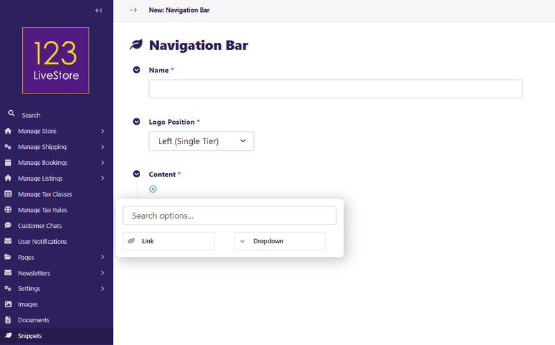
Fields
Name: A unique name for your navbar. It can be anything, it is just used as a personal reference to easily tell them apart.
Logo Position: You have 2 options: Left (Single Tier) and Centered (Two Tiers).
Content: You can have a Link or a Dropdown
Custom CSS class: If you need to add a specific css class for this navbar, add it here.
Custom ID: If you need to add a specific ID for this navbar, add it here.
Let’s add Links to our navigation bar.
- Click “choose page” and link to “Home”
- Add another by selecting the “+” at the bottom of the page.
- Click “choose page” and link to “About Us”
- Add another by selecting the “+” at the bottom of the page.
- Click “choose page” and link to “Shop Now”
- Add another by selecting the “+” at the bottom of the page.
- Click “choose page” and link to “Blog”
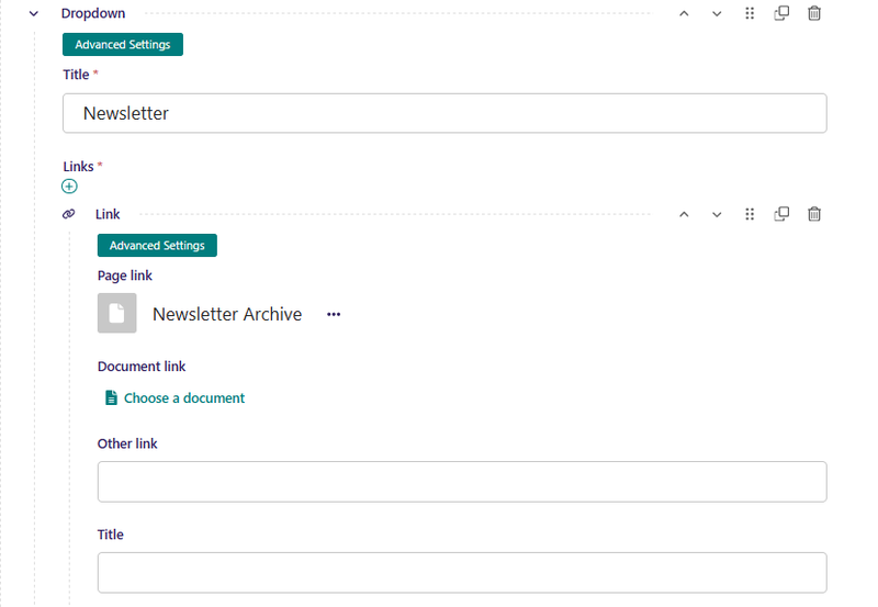
- For the 'Newsletter' and 'Help' options, these are dropdowns:
- When you are done creating your Main Nav Bar, click Save
Multilingual: When the site language changes, page links inside the navbar automatically resolve to the translated version of the page if a translation exists.
Back to Top
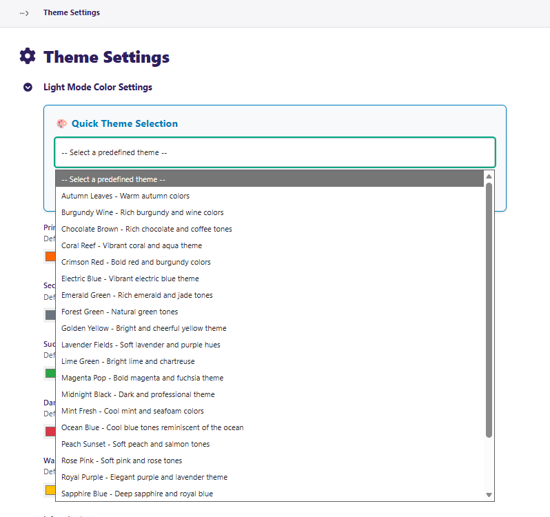
11. Predefined Themes
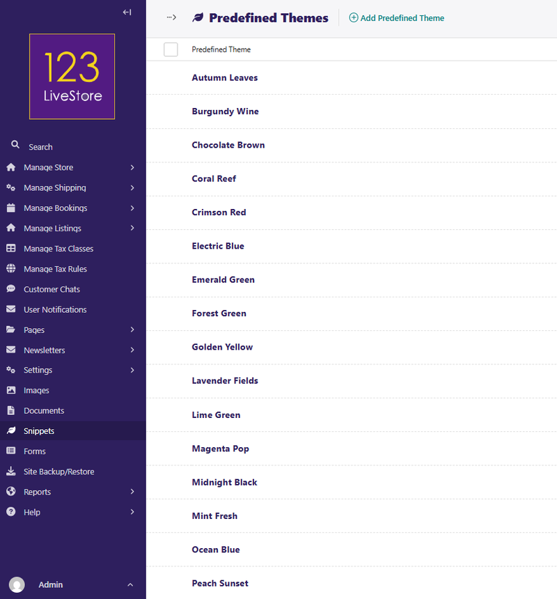
Predefined Themes is a named colour palette that can be applied to the site's Theme Settings. Instead of manually entering hex codes each time you redesign, save a theme here and apply it in one click.
Fields
| Field | Purpose |
|---|---|
| Name | Theme label (e.g., "Ocean Blue", "Corporate Dark") |
| Description | Optional notes about the theme |
| Primary Color / Secondary Color | Core brand colours |
| Navbar Colors | Background, link, hover, dropdown colours |
| Footer Colors | Background, text, link, hover colours |
| Body background / Text color | Page-level base colours |
Usage
Go to Settings → Theme Settings and select this theme from the Predefined Theme dropdown to apply it to the site.
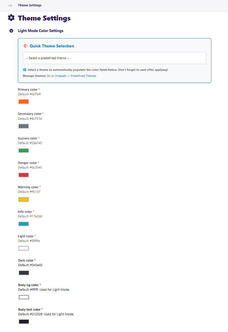
Tip: Save your current live colours as a theme before experimenting — you can restore them instantly if needed.
Back to Top
12. Product Attributes
A Product Attribute is a configurable product attribute type (e.g., Colour, Size, Weight) with a predefined list of allowed values. These attributes are used by product variants in the store.
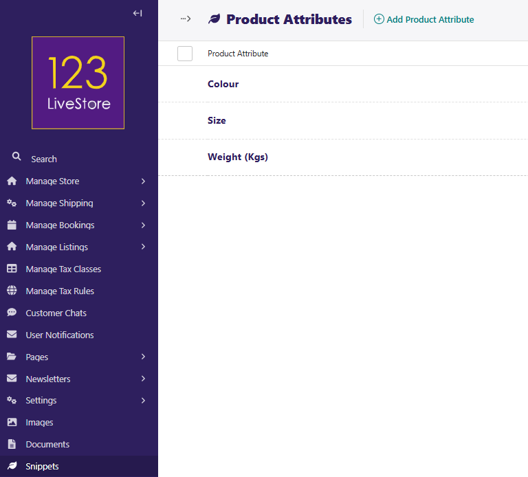
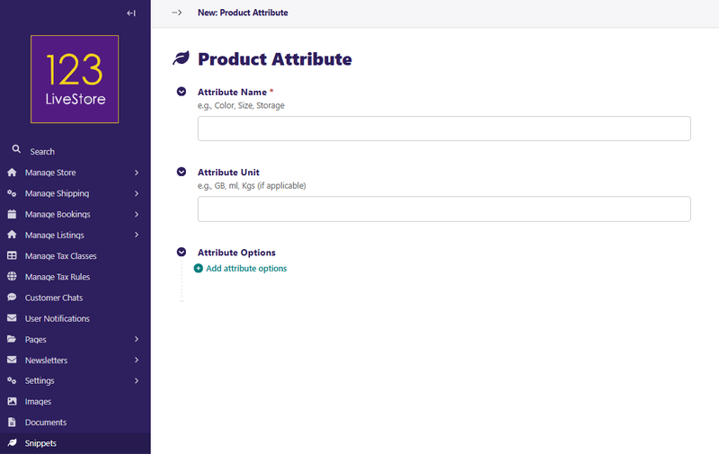
Fields
| Field | Purpose |
|---|---|
| Attribute Name | The attribute label (e.g., `Color`, `Size`, `Weight`) |
| Attribute Unit | Optional unit suffix (e.g., `GB`, `ml`, `kg`) — appended to the attribute name |
| Attribute Options | The allowed values for this attribute (e.g., `Red`, `Blue`, `Large`, `256`) — added inline |
Usage
When creating or editing a Product in the store, assign these attributes to product variants.
Multilingual: If the site has multiple languages, translate attribute names and option values via Product Attributes Translation.
Back to Top
13. Product Attributes Management
Product Attributes Management is a shortcut link in the Snippets menu that opens the dedicated Product Attributes Management interface — a more detailed UI for managing attributes and their options with bulk editing support.
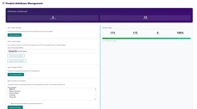
Usage
Anytime you create new Attributes on a multi-locale site, you need to first 'Extract New Attributes' to be translated. If you wish to translate the new strings manually, then follow Step 3: Manage Attributes. To use OpenAI translation, perform Step 4: Translate All with OpenAI. Select the languages you wish to translate. Use the Shift key together with clicking your mouse pointer on the language you wish to add to be translated, and click the 'Translate All with OpenAI'. Upon completion, the 'Pending' count should display '0'.
Back to Top
14. Product Attributes Translations
Product Attributes Translation is a lookup table for translating product attribute names and option values into other languages. Works the same way as Dynamic Translation but scoped specifically to store attributes.
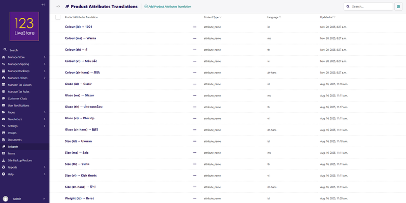
Fields
| Field | Purpose |
|---|---|
| Content Type | Either `Attribute Name` or `Attribute Option Value` |
| Original Text (English) | The exact English text as stored in the database |
| Language | Target language code (e.g., `ms`, `zh-hans`, `th`, `vi`) |
| Translation | The translated text |
Usage
- Go to Snippets → Product Attributes Translations and click Add product attributes translation.
- Choose Content Type — `Attribute Name` for translating the attribute label itself, `Attribute Option Value` for translating individual options.
- Enter the Original Text exactly as it appears (e.g., `Color` or `Red`).
- Select the Language.
- Enter the Translation.
- Save.
Tip: Use the Content Type filter and language search to manage translations by batch. The store front-end automatically resolves translations at render time; English is always the fallback.
Back to Top
15. Reusable Content
A general-purpose snippet for any piece of rich content (text, images, buttons, layout blocks) that needs to appear on multiple pages without being duplicated. Edit once, update everywhere.
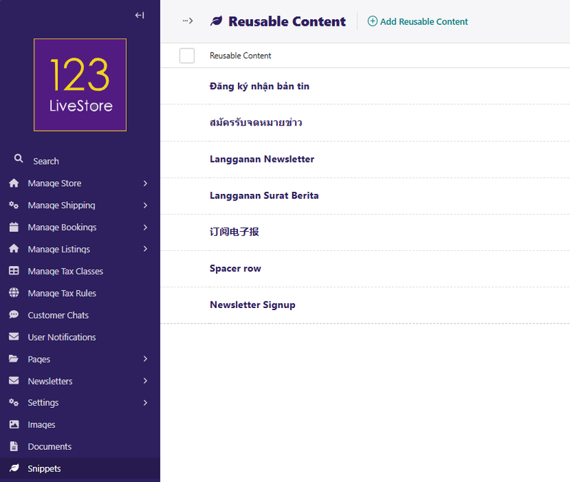
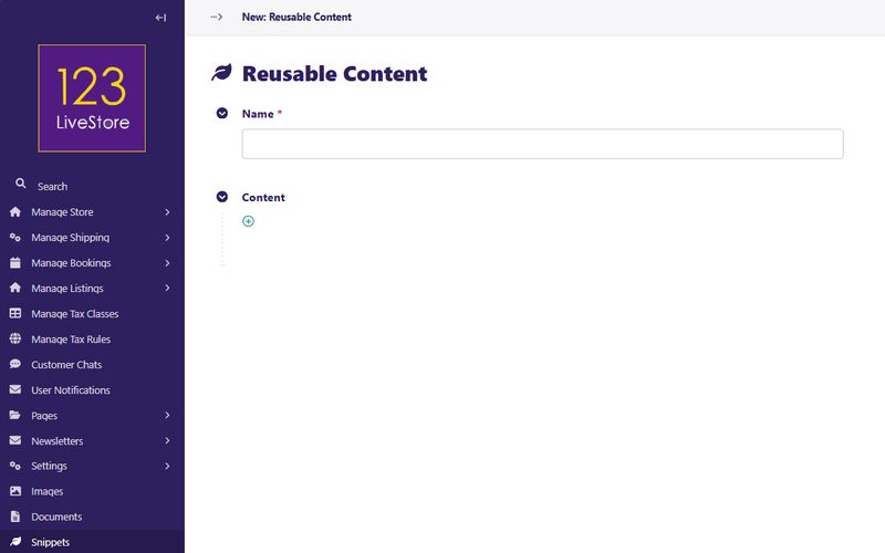
Fields
| Field | Purpose |
|---|---|
| Name | Internal Label |
| Content | Full rich content stream — supports all standard page content blocks |
Usage
- Go to Snippets → Reusable Content and click Add reusable content.
- Give it a descriptive Name (e.g., "COVID Notice Banner", "Payment Trust Badges").
- Build the content using blocks — text, images, buttons, cards, etc.
- Save.
On any page, add a Reusable Content block inside a StreamField body and choose this snippet.
Common use cases:
- A promotional banner repeated across multiple pages
- A "Trust Badges" payment icons row embedded in product and checkout pages
- A legal disclaimer block used on multiple policy pages
- A staff profiles section used in both the About and Contact pages
Back to Top
16. Subscription Access Rules
A Subscription Access Rules is a gating rule that links a specific page to a required subscription product. When a rule exists for a page, only users who have purchased (and hold an active) subscription to the mapped product are permitted to view that page. Everyone else is redirected.
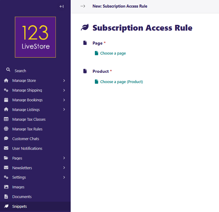
Fields
| Field | Purpose |
|---|---|
| Page | The page to protect — any page in the site tree can be selected |
| Product | The subscription product whose active purchasers are granted access — only products marked as Is Subscription are shown |
Usage
- First, ensure you have a Subscription Product in the store:
- Go to the Store page tree and open (or create) a Product Page.
- Enable the Is Subscription toggle on that product.
- Save and publish the product. - Go to Snippets → Subscription Access Rules and click Add subscription access rule.
- Use the Page chooser to select the page you want to protect (e.g., "Member Resources", "Premium Course Content").
- Use the Product chooser to select the subscription product required for access.
- Save.
How it works at runtime
- When a logged-in user visits the protected page, the system checks whether they have an active, paid subscription to the linked product.
- If they do, the page loads normally.
- If they do not (or are not logged in), they are redirected — typically to the subscription product's purchase page.
- Each page can only have one access rule (one-to-one relationship).
Common use cases:
- Members-only content hub (e.g., "Premium Downloads")
- Paid course or training module pages
- Exclusive offer or pricing pages for subscribers
- Private community or resource pages
Tip: To create a full subscription content area, set the rule on the top-level section page. Child pages inherit the restriction through the standard page permission flow. Always test the redirect by visiting the protected page while logged out before going live.
Back to Top